Nationwide
GoCloud

Client:
Nationwide Insurance
Role:
UX Design, UX Research
Project:
Web Site (Intranet)
Tech:
Sketch, Adobe Creative Cloud, Axure RP

01

Overview

Project Overview

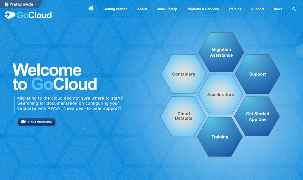
Nationwide was in the process of migrating their infrastructure to the cloud. With a plethora of products, services and technologies, Nationwide wanted to create a multi-pronged, intranet portal for their teams. This portal would provide:

  • An overview of Nationwide’s new cloud-based products and services.
  • A Documentation section for Nationwide teams to reference relevant documentation for migrating and maintaining their projects on the new cloud-based platform.
  • A Tutorial and Support section that included guided help, role-based training, community support with internal RocketChat and AnswerHub segments, and a priority-based help desk system.

Kickoff Meeting

I held an initial kick-off meeting with key members of the GoCloud team and members of upper management.

In the meeting we discussed project scope, business goals, an overview of existing demographic data and relevant, specific business ops. Qualitative and quantitative data was presented to me from their initial, but limited amount of user research garnered from an internal user survey.

User Interviews

Initial forays identified three main user roles:
  1. Application Product Managers (APMs)
  2. Architects
  3. Developers
After identifying the main user groups, I conducted usability interviews with 9 users across these three user groups, to collect current usage patterns and identify pain points. I wanted to know what they liked about the existing site and what they didn’t like. There were a lot of common pain points, and yet there was overlap as to the things they liked.

User Personas

In order to have a reliable representation of the identified user roles, I synthesized the user interviews into 3 user personas representing each role group of APMs, Architects and Developers.
GoCloud User Persona

Journey Maps

To better understand the day-to-day tasks of each user role, I created a journey map which represented the common usage patterns and resources accessed by each role member during the lifespan of the project. I then validated the journey map with project stakeholders and users.

Card Sort (Open)

One of the biggest challenges was the information architecture of the products and services. Initial user interviews returned responses in which users could not agree on how to organize or group their products and services. There was even differing thoughts among members of the same user roles (Ie. developers) as to what categories certain products and services belonged to. Complicating it further, some products and services could truly fit in multiple categories. As a result I decided to conduct an online, open-category card sort to collect user input on preferred grouping of products and services and see if I could find commonalities and areas of effective compromise. I chose an open sort because I wanted to be as broad as possible due to lack of any consistent consensus from team members. The card sort results provided some insight into how users would group these items on their own and various category names and labels.

Information Architecture

After exploring the card sort data further, and after input from the previous stakeholders meeting, I synthesized the card sort research and the journey map into a preliminary informational hierarchy and presented it to stakeholders. I then handed off the IA diagram and list of suggested content changes to the content team to validate. Our findings were that while we had made significant progress with the IA, we weren’t where we needed to be in terms of reaching a viable consensus across the user roles for how products and services should be grouped.

Second Card Sort (Closed)

In order to try and obtain a consensus, I conducted a second round of closed-category card sort testing to validate informational hierarchy and get more insight into manager role preferences.

Interactive Prototype

The closed card sort helped narrow things down. I synthesized my findings into an interactive prototype concept using Axure RP, validated this with project stakeholders and iterated based on feedback.

GoCloud Prototype

Usability Testing

I then conducted a prototype usability test with 6 users, 2 in each role group. Audio, video, time and results were recorded.

Parameters

Goal was to test usability, navigational flow, and information architecture for each identified role group:
  • 6 participants; 2 developers, 2 architects, and 2 managers
  • Participants were given a link to the prototype, to access using their own computer
  • Participants were given 4 tasks to complete based on role; completion time was recorded
  • 20-30 minute sessions
  • Minimal search functionality, no filtering; mainly a test of navigation
  • Participants were given 5 follow-up questions

User Feedback

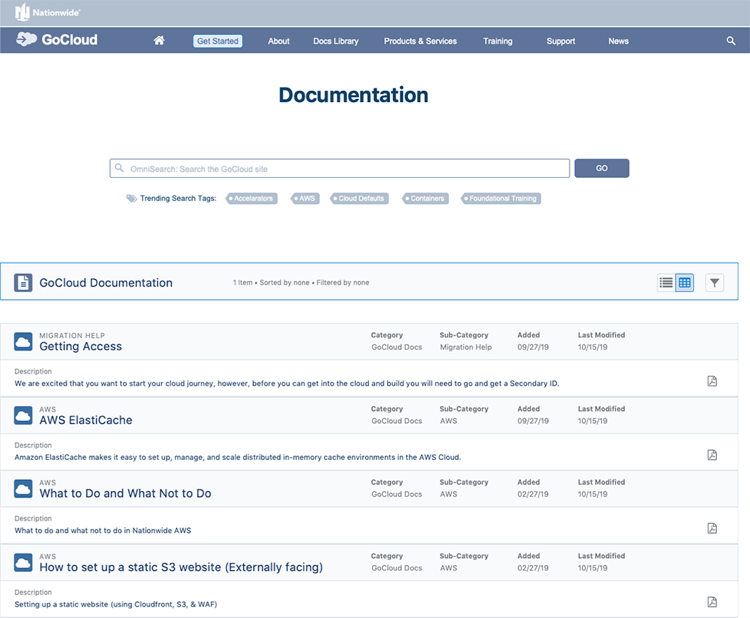
User feedback was very favorable, and included some valuable input from of a “happy accident” on one of the search features: The prototype provided search tags under the omni search box. These tags were automatically generated based on the most trending keywords searched for. One test user commented that the search tags could also serve a secondary purpose: to indirectly alert users if a system was down. Ie. If a system was down, there would be a trending search for that specific system, which would then show up in the trending search tags. Very neat happy accident that yielded a valuable UI feature.

However, something occurred to me while reviewing the user ability testing: perhaps there was a situation of different mental models preferring different ways of doing things. It became apparent that perhaps the solution was to tailor the information architecture so that each role group could find the information they wanted, using UI elements and methodologies of their choice instead of a one-size-fits-all sort of thing.

Ex.: Devs preferred a straight-forward approach via a search box so they could type in what they were looking for and then narrow down the results if needed. Architects and APMs preferred a navigation system that utilized a mega-menu with relevant main-category iconography that allowed them to drill-down into categories and also visually reference the products and services that related to them.

There also remained the challenge of how to group items in which terminology for the same concepts, was different amongst user roles. The solution was to create a hyper-linked product and services index in which users could reference that in alphabetical order. When they found the term / product / service they were interested in, they could click on it and go to the relevant section or page.

At this point, the prototype was well-received. A/B testing results between the old site and new prototype showed time / results were superior in approximately 80% of the areas tested including finding relevant content, search functionality, navigation elements and information architecture. The remaining 20% discrepancy was related to test users during the first testing round, being familiar with the old GoCloud site and expecting information to still be grouped that way. However, comments were unanimous that it was just a matter of them “unlearning” and they greatly preferred the new information architecture.

I implemented the index into the prototype and ran another round of usability testing under the same parameters. The users seemed to really like this and it was well-received. The quantitative data showed improved numbers across the board finding relevant information. The qualitative data from the respondents comments was also similarly encouraging.

Validation

I collected and synthesized the test data and compiled a report. I compared against initial survey results and briefed the stakeholders.

Final Prototype and Hand-Off

It was agreed that data from the second round of testing put us right where we wanted to be and we passed the prototype off for final high-fidelity designs.

Design Comps (Hi-Fi) + Video Logo Reveals

At this point, my role in the project and my contract had been completed and fulfilled. I had decided early-on that I would provide some hi-fidelity artwork and creative designs as an “added bonus” for my contributions to the project. I created several design comps utilizing Nationwide branding standards and assets. I also create video logo reveals for training videos where applicable.
GoCloud-Hexagon
GoCloud-Alt-4
GoCloud-Alt-3
GoCloud-Alt-5