American
Religious Sounds

Client:
The Ohio State University
Role:
Creative Lead, UX Design, Motion Graphics
Project:
Web Site
Tech:
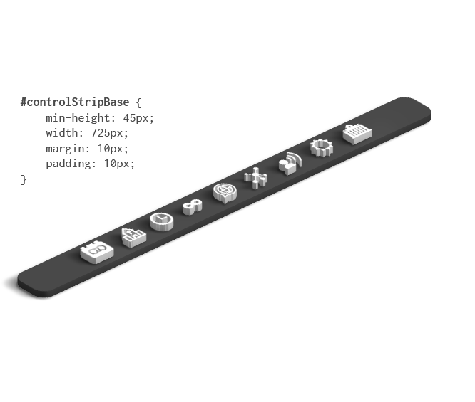
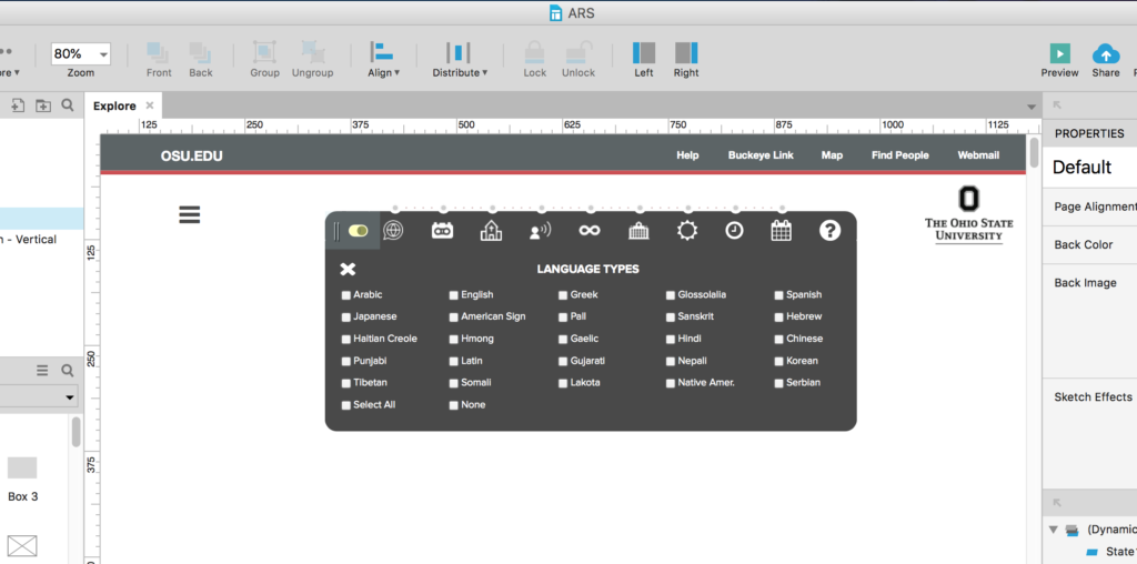
Sketch, Adobe Creative Cloud, Axure RP

01

Overview

Overview

Professors Weiner and DeRogatis approached our Team with a very unique project:

“Working under faculty supervision, student and staff researchers are producing high-quality audio recordings of religion in practice. Drawing on this archive, we will construct a digital platform that integrates sound, images, and text to offer new insights into the complex dynamics of American religious pluralism. The resulting website will offer new research and pedagogical tools for scholars and an interactive resource for the general public.

  • What does religion in the United States sound like?
  • Where should one go to hear it? How might we understand religious diversity differently if we begin by listening for it?

These questions animate the American Religious Sounds Project, which will offer new resources for documenting and interpreting the diversity of American religious life by attending to its varied sonic cultures.”

Kick-off Meeting

ARS explained the data sets, their ideas for how they wanted the data to be visualized, the diversity of the target audience and how their project had made national news. They also provided date from their own previous marketing research including demographic data and stakeholder requirements.

User Research

The client provided the majority of the research data.  As with many University projects, the target audience is both demographically and geographically diverse: visitors from around the globe, a large age-range and from all walks of life. One segment of the project have been featured by local and national news media in a human-interest story and it was mainstream content. While my main role on this project was UI / UX design, I did some minimal user research and interviewed 4 different user types:
  • Researchers / Professors
  • Students
  • General Public
  • Media
I wanted to interview some general students not directly involved in this type of academic field.  This required some guerrilla research outside of the OSU campus Starbucks.  I offered Starbucks cards to participating students, to get their general take on the project. (It was also a good excuse to work from Starbucks on these days. Sorry, not sorry.)

User Personas

After my initial interviews, I created user personas of the 4 user types. This was to help me identify user needs and expectations, and also provided a benefit to Professors Weiner and DeRogatis as to initial site features for the visualization and UI that I was responsible for.

User Personal - ARS

Design

The main challenge of the project was creating a viable UI / UX for very technical, graph theory-based data visualizations. The clients’ data store was complex, with multiple datasets, 9 different view-types, with some views having up to 28 individual filters. In addition, the clients requested the ability to view photos and play audio that accompanied individual dataset records.

Both professors were absolutely firm that the main ‘Connections’ visualization utilize the graph theory set-up (below) for their visualizations. There were several challenges to this:

Due to the small size of the node click-points on the graph and the number of different nodes, the graph needed to be as large as possible, which meant I had to maximize screen real estate.

Wireframes

Wireframes were created using my iPad Pro and Adobe Comp, for one of the visualization pages, to map out my idea for a layout that utilized the maximum amount of screen space for the graph theory visualization and also a minimally-invasive control strip that partnered it. It wasn’t apparent to the client at this point, but the control strip ended up being the crown-jewel of the project as you will see further below.

The visualization had nine main filters, with several of those filters having over 30 sub-filters for the data sets.

My first thought was to create an off-canvas UI that slid on and off the side of the screen upon toggle.  This would allow the visualization itself to be full-screen while allowing the end-user access to minimally-invasive, on-demand filtering system controls..

But  as I got into my wire-framing above, I felt we could do better…

I came up with the idea for a thin, collapsible control strip.  It had an icon for each main filter and on clicking, would expand to show the relevant sub-filters.  Upon each filter activation / de-activation, the full-screen graph that I dubbed “the amoeba” would update in real-time.

Prototype

ARS - Control Strip 3D isometric

I used Axure RP to design an interactive prototype of the control strip and main navigation system.

ARS - Axure 1

I utilized icons from FontAwesome and Google Material sets.  (Note: the client loved the icons but decided to swap out some of the initial choices and implement a few of their own as seen below):

The final UI design was a thin, icon-driven control strip that was not only toggleable, but had a collapsing filtering system, real-time visualization updates upon applying each filter or view, and slick UI control structure transitions on page-load to subliminally alert the end-user to their functionality.

Oh, there’s just one more thing…

It was also draggable.

The end-user could toggle, collapse AND drag the control strip around the screen to position, re-position, hide and un-hide according to their preferred, available screen space and the type of visualization they were performing.

I felt like Steve Jobs when presenting this to the stakeholders – including the “Oh, there’s just one more thing…” line.  There was legit applause and exclamations from the meeting room.

Because the control strip was a rather unique UI / UX component I wanted to leave some sort of subtle visual cues as to how it worked. I didn’t want to clutter the UI with a bunch of labels. I felt they would be distracting more than they would be helpful. Micro-animations were the answer:

Upon page load for the first time, the interface would cycle through a concise and linear animation that would visually alert the user that certain elements were interactive. The control strip would show the labels and then they would slowly fade out. On mouse-over, the labels would reappear accordingly. I also had an option to allow this to be toggled off or on and stored via browser cookie. I’ve found that it’s the little things that make a big difference.

High-fidelity Comps

Mock-ups and design comps for other areas of the site were done in Sketch and Photoshop, and exported to InVision for collaboration amongst the project team and client.

ARS - high fidelity mock-up

I even had an initial idea to try a cool and beautiful animated music player interface created in Adobe After Effects and complete with real-time sound visualization:

ARS - Music Player

The client absolutely loved the creative designs, but felt that they wanted a more clean and less artistic look so that the focus could be solely on the project’s audio. So we went with the following look:

ARS Style Guide Isometric

04

Testing

Testing

For user-testing, we placed the visualizations on a password-protected staging server to allow client and shareholder access. Testing results for the control strip showed UI recognition, cognition and familiarity in under 60 seconds of first use.

The client and stakeholders absolutely loved the control strip UI and found it incredibly intuitive and functional – especially considering the mandatory graph theory parameters we had to work within.

9 filters. Up to 30 sub-filters. Only 35 pixels high.

Winning.